Bookmarked
End to End Web App
My Role
UX/UI Designer
Timeline
2 Weeks
Tools
Figma
Industry
Education, Social Media, Entertainment, Retail Bookseller, Media
Overview
Bookmarked is a platform that connects people who like to read, want to get book recommendations, join book groups, find classes, and read/listen to audiobooks all in one place.
Background
Since COVID 19, there has been a high increase of schools switching or offering classes online instead of in person. There are different online programs to help with this, but I wanted to learn the benefits and drawbacks to major ones currently being used today and help adults learn.
Problem
My initial problem was that learning can be stagnent for adults after college and they might want a place to be able to learn. After talking to users, I changed my problem to that adults want a place to read books, take online classes (like back in high school or college) while reading them, and have a place to form book groups.
Solution
Create a one stop shop for people to be able to read, make reading lists, connect with people, attend classes, and make book groups all online.
First… I conducted a competitive analysis.
Opportunities Based on Analysis
There is room for improvement when it comes to finding a balance between asynchronous and synchronous classes
Benefits to being able to get feedback (either via a program within the app or by a teacher)
Being able to interact with peers who are taking the courses could be beneficial
Second… I conducted user interviews.
Primary Research
I conducted User Interviews via zoom with 5 participants ranging in age from 23-64 years old.
This gave me an in-depth look into users' thoughts and experiences about what they look for in an online education platform and what specifically they wanted to learn.
Interview Goals
Determine what adults look for in a learning platform
What adults want to learn
If there is any other aspects to current learning apps that they feel could be improved
Results
A few major categories came out of my interviews.
Adults miss having a classroom where they can learn
Users commonly used reading as a way to educate themselves post college
People wanted a way to be able to combine reading, education, and social aspects (like book groups) into one place
One person said they already participate in online book groups, but would like better resources to help schedule, pick books, and have meetings
POV and HMW
In order to narrow my problem after my interviews, I made point of view (POV) statements and how might we (HMW) questions. This helped me to understand my users’ and their needs.
POV
I’d like to explore helping adults learn more about literature as they read books.
HMW
How might we help adults to join book groups, attend classes, and access a full library of books in order to further their growth and knowledge.
Third… I defined my user personas.
User Personas
Next, in order to create my web app, I needed to define the different users that would be taking advantage of this app.
Fourth… I thought about information architecture.
Task Flows
I then turned my attention to the specific task flows and decisions users would be making within each page. This allowed me to organize my ideas before translating them into visual design.
Design Decisions
Based on my user interviews, they lacked a place for education as they have become an adult, lacked organization of their book groups, and wanted to have a place to read books online. Being able to take courses, create book groups, and view the library (and create saved book lists) are the 3 most important pillars for my web app design.
Fifth… I created low and mid- fidelity wireframes.
Low Fidelity Wireframes
I started the design process by creating low-fidelity wireframes by sketching. These sketches show a few different potential pages of the web application.
Design Decisions
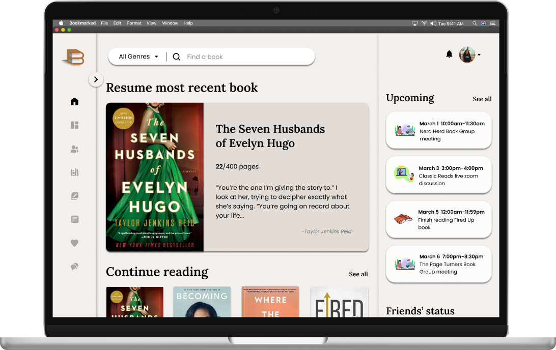
I thought it was important to have a homepage, dashboard (that shows the stats of your reading progress), library, courses, and book group pages. Based on what users said about not wanting to waste time, I decided to add a ‘Continue Reading’ section to make it faster and easier to access the most recent book.
Mid Fidelity Wireframes & Design Decisions
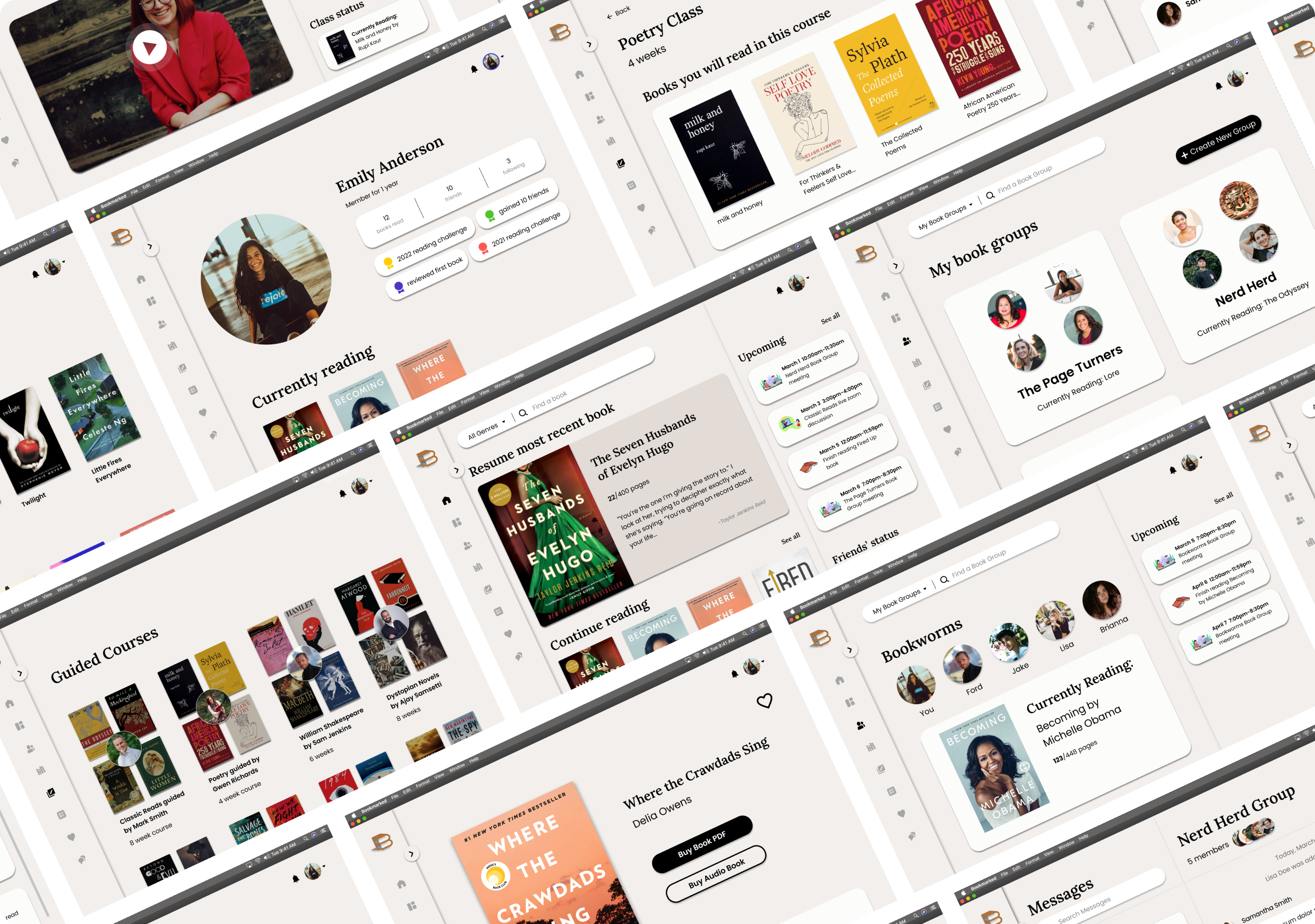
Next, I translated those sketches into mid-fidelity wireframes in Figma. Based on user interviews (wanting to improve their experience with organizing book groups, have a place to take a class on literature, and read books all in one place), I decided to focus on these main pages of how to create and view book groups (see who is in each book group), the homepage for a poetry class (with the books that will be read, syllabi, and instructor info), dashboard (to see your education and reading progress), as well as a book details page (with reviews and description).
Sixth… I defined the brand design and components.
Brand Design
For this brand design, I wanted to keep it consistent with old book colors. I wanted the web app background to be an off-white color, much like you would find a page of a book. The logo was inspired by viewing a stack of books on its side (to create a B shape).
UI Component Set
After creating my brand style, I then built out my UI component set in order to create consistency across my web app as well as make my time wireframing easier. This includes creating cards for upcoming events, message cards, book club, books, book reviews, course titles, dashboard cards, and more. I wanted each card to be slightly different but cohesive.
Seventh… I created High Fidelity Wireframes.
Hi-Fi Wireframes & Design Decisions
I then incorporated my brand design and UI components into my wireframes to create high-fidelity wireframes. One of the most important aspects of a book group (from my user interviews) is voting on what book your group will read next, so I added a voting feature. From my user interviews, I also understood that it is important to users to have a list of books they are currently reading and books they want to read, which I put on the profile page.
Eighth… I created a prototype and tested with users.
Creating Prototype
I used Figma’s prototype feature to turn my high-fidelity wireframes into prototypes. Click the image to view the prototype in Figma.
What I was looking to test
Understand the ease of use and completion rate of the different tasks I asked my users to go through
Find pain points within my task flow
Access users’ feelings towards UI Elements
How I tested
I used Figma’s prototype setting and Zoom to run through my wireframes with my 5 participants, running through 4 different task flows (navigate to a book product page, message your friend, join a book group and vote for a book, join a class and view the class page).
What worked
Everyone was able to run through each flow
People liked my UI design
People said they were likely to use this web app (they especially liked the book group and class/course feature of the web app)
Feedback and iterations
People wanted a place where they could easily navigate to their zoom meeting
People also wanted a feed where they could see the current activity and status of their friends
Ninth… I iterated my design based on user feedback.
Iteration #1
I added a few cards on the sidebar of the class page which shows the zoom link needed to enter their live sessions, their calendar, and a list of their classmates. Some users told me that they can’t always find the zoom link that they need to enter their class. They requested that I have a set place on the class homepage that clearly shows the link.
Before
After
Iteration #2
I added a ‘Feed’ page where users can see their friends’ activities including finishing a book, reviewing a book, completing a course, and more.
Added
Overview of Iterations and Overall Design Decisions
Overall, I made these two iterations based on user feedback. My priority throughout the web app was to create an all-in-one learning literature application, based on users’ wants & needs as well as compared to competitors. I wanted the overall design to feel modern, yet look like an old book with off-white and brown colors.
By offering the ability to read within the platform, create book lists, attend classes, create book groups, and view your reading stats, this app is a well-rounded learning application to help adults learn in a fun, easy, and simple way even after college.
Next Steps…
Test the iterations on users
Prep/ organize the design files for developers
Key takeaways and learnings…
I learned how to create a web application and dashboard in this project.
I also learned how important user interviews are. These interviews prior to the project really shaped what my web application came to be.


